Hi! I'm currently reworking my site, so although this content is still online things may change or look odd. Please get in touch to find out how I can help you!
Do Newspapers Still Care About The Fold?

"The fold" is a phrase that holds great notoriety amongst web designers. Originating from newspaper design, "the fold" represents the point at which a newspaper would be folded for display. The idea was that the designers would place the most exciting news "above the fold" so as to gain people’s attention and get them to buy the newspaper.
In the early days of the web, web designers would try to do the same, only in this case the fold was the bottom of the viewport - below that the user would have to scroll down, and research at the time suggested that some people wouldn’t bother. If you wanted it to be read, it had to be as high up the page as possible.
Over time there have been many discussions over whether the fold is still relevant to web design as users have become more comfortable with scrolling. Articles like Paddy Donnelly’s "Life Below 600px" and Roger Johansson’s "Don’t fear the fold - people do scroll" have issued a rallying cry against worrying about whether content is above or below this magical line. Even Jakob Nielsen retracted his original guideline to avoid scrolling pages at the end of 1997. That’s over 12 years ago now, and the mission of cramming everything "above the fold" is less of a concern.
What about newspapers?
While the web design community is undoubtedly relieved at the decline in importance of the fold, something that has perhaps not been noticed is that even some newspapers don’t bother with the fold so much these days. It struck me when I saw a folded tabloid, and the only word of news visible was "Cricket". The only other visible items were the newspaper’s logo, and a huge advert for a promotion they were running.
I decided to see whether this more relaxed attitude towards the fold was reflected in other newspapers, so off I went to the local shop and bought a copy of every paper I could lay my hands on.The guy behind the counter gave me a funny look, but I reassured him that it was for "research" and he let me out without pressing the panic button.
The findings
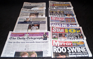
When I got home and laid out my haul, neatly folded side-by-side, I noticed that some newspapers did seem to consider the fold in their design, and others didn’t. What’s interesting is that the ones that did were the higher-brow papers like The Times, The Independent, The Guardian and The Daily Telegraph. The ones that didn’t were the lower-brow red-tops (The Sun, the Daily Star and the Daily Mirror), plus the Daily Mail and the Daily Express - which have aspirations towards the highbrow but have common qualities with the red-tops too.
The fold is strong with these ones
The papers that do consider the fold mostly ran with different stories as their main headline, in an attempt to differentiate from their competitors and appeal to different market segments. They seem to consider the fold to varying degrees, however.
The Independent
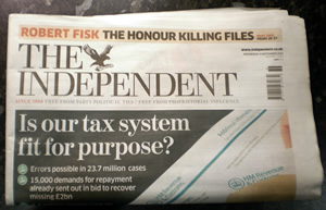
The Independent’s front page is dedicated to one story - that of the current controversy over mistakes made by the British Inland Revenue which have left a lot of people owing money. Above the fold, the headline "Is our tax system fit for purpose?" and a couple of shocking bullet-points are the main focus of attention. There’s a small strapline at the very top for a column by Robert Fisk, but that’s it. A large portion of the page is given over to an eye-catching photo of some HMRC tax forms, a design technique not used in any of the other papers in this group.
The Times
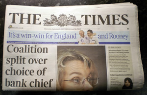
Cramming a little more content in above the fold is The Times. The main headline "Coalition split over choice of bank chief" - about the Lib-Con difference of opinion on the new Barclays Bank chief executive - is fully visible, as is a banner for the big sports story of the day, the England football team’s victory over Switzerland. Also visible is a sidebar titled "In the news" which has a couple of excerpts from articles on doctors’ working hours and the story of a woman sentenced to death in Iran for adultery. Finally you can see the top half of someone’s face - it turns out to be Jenny Watson, a former public servant who has recently been sacked for incompetence. Not such an important story, so the designers evidently relegated its headline to "below-the-fold" status.
The Guardian
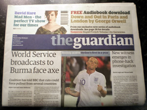
The second most fold-conscious paper here, and in my opinion the best-designed overall, is the Guardian. The main stories are "World Service broadcasts to Burma face axe" - about the BBC’s funding cutbacks - and "New witness emerges in phone-hack investigation" - about the News of the World voicemail-hacking scandal. These two stories have full headlines and the first couple of paragraphs above the fold, and the main story also has a tagline to entice readers in. Also visible above the fold are a picture of Wayne Rooney in a professional capacity (more of Mr Rooney later), and also call-out boxes for the lead story in the G2 supplement and a free George Orwell audiobook.
The Daily Telegraph
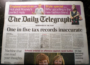
The largest physical newspaper under investigation here seems to take the fold much most seriously - there are four headlines visible above the fold, plus two call-out boxes at the top for stories in sport and fashion. The main headline is the British tax story again, only this time three-quarters of the article is visible above the fold, with the story continued on page 2.
Also visible are the somewhat sensationalist "Machine that can read your thoughts", "Schools ordered on offensive against racist bullies" and "EU law harming doctors’ training" - these relate to stories that appear below the fold, but the designers obviously considered the headlines important enough to be above the fold, or else the main story could have taken up more space on the page.
Fold? What fold?
The papers that don’t seem bothered about the fold mostly focused on one story - that of the aforementioned Mr Rooney’s alleged extra-marital excursions. Grotty stuff, but not exactly the same calibre of news as the first group. An interesting observation is that every single one of the papers in this group dedicated more above-the-fold space to adverts or promotions than to news stories.
The Sun
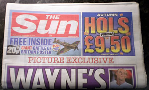
Probably the least-bothered about the fold is The Sun. The most prominent element on the page is an advert for their "£9.50 holiday" promotion. Also at the top of the page is the proclamation that there’s a free Battle of Britain poster inside. But what about the news? Oh, there it is, you can just about see the word "Wayne’s", helpfully illustrated with a tiny picture of Wayne Rooney. They make a big deal of the fact that this story is a "picture exclusive", but the above-the-fold content here is trivial.
Daily Star
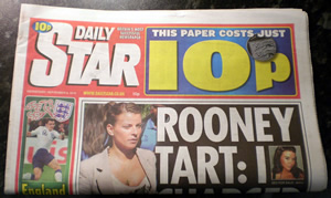
Sticking with the red-tops, the Daily Star have also decided that Mr and Mrs Rooney’s private lives are of vital importance, but dedicate about one-quarter of their above-the-fold space to a huge box that says "This paper costs just 10p". On the left there’s a picture of an unidentified England player, but the main text above the fold is "Rooney Tart: I" , illustrated with a tiny thumbnail of a prostitute who claims to have charged Rooney an "ugly tax", but a significantly larger picture of Mrs Rooney herself, which at first glance makes it look like they’re calling her a tart instead!
Daily Express
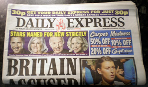
The Daily Express runs with a story no other paper deemed front page-worthy, that of a group of Germans who allegedly accuse Britain of war crimes during the Dresden bombings of World War II. Despite the fact that it’s their main story, the Daily Express obviously consider it less important or less relevant than the fact that Paul Daniels and Ann Widdecombe (among others) will be appearing on the new series of Strictly Come Dancing, seeing as the panel showing their beaming faces pushes the main story down so far that the only word fully visible above the fold is the tantalisingly-vague "Britain" - you can just about make out the word "accused" if you give it more than a cursory glance.
At the top of the page is a sneaky banner that seems to declare the price of this paper as 30p, but in fact is a voucher to get tomorrow’s paper for 30p, down from the usual 40p. An example of dark patterns in print media, perhaps? There’s also an advert for Carpet Right, titled "Carpet Madness", which claims to offer 50%, then 20%, then 10% off carpets. Quite why they didn’t just say 64% off I don’t know, perhaps they were hoping to trick people into thinking it was actually 80% off? Or perhaps "Carpet Madness" refers to the fate of the poor soul who had to design the advert, who knows? Finally, there’s a picture of Colleen Rooney, just in case she felt left out compared to the other "celebrities" on the page.
Daily Mirror
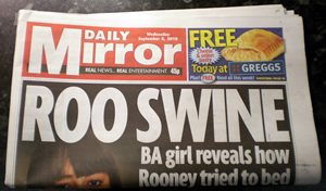
The last of the red-tops, the Daily Mirror also goes with the Rooney story, but their spin on it is that a stewardess is claiming Rooney tried to sleep with her on his stag night. At the top-right of the page there’s an advert for a free cheese and onion pasty from Greggs, but they manage to get a bit more content above the fold this time, with room for a massive headline with the inevitable "Roo" / "you" pun, and two-thirds of the tagline "BA girl reveals how Rooney tried to bed". You can just see the girl’s eyes in another full-page photo, presumably to add a bit of weight to the story, the assumption being that if she’s prepared to put her face to it, it’s less likely that she’s lying.
Daily Mail
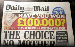
Last in the group that gave the fold a quick glance and then said "bothered", it’s the Daily Mail. The only member of this group not to have a reference to "Rooneygate" , the Daily Mail’s main front-page article is the tragic story of a pregnant mother who had to choose which of her two children to save from drowning in their crashed car. It’s not exactly handled sensitively though, with the main focus of the page being a gaudy box asking "Have you won £100,000?" - like the Daily Express, this pushes the main article down so far that you can only see the first one-and-a-half lines of the headline. Also on the page is a sidebar regarding the UK tax crisis, with the headline and first paragraph visible above the fold.
What does all this mean?
Looking at the evidence, it’s obvious that opinions on the importance of the fold differ wildly between different publications. It seems that the papers that trade based on their news content place more importance on the fold, because they rely on pushing the stories to their readers. The papers that trade based on opinion, gossip and "celebs" seem less bothered, perhaps because they feel confident that their reader base will choose them anyway because they agree with the opinion or enjoy the "scoop" in the gossip columns
One thing to consider is how the newspapers expect to be displayed. Papers can be displayed in a wide variety of ways, from special stands that show the full front page, to stacked up in a corner with only the mastheads showing. So perhaps the fold is less relevant now than it was before.
However, the papers in the "not bothered" group didn’t even have much news content on the whole front page so my conclusion would have to be that these papers don’t need to worry about the fold, because the readership will still buy their publication over a competitor for the non-news content. This is evident from the fact that these papers all prominently displayed special offers on their front pages - they clearly feel that their readers consider a free pasty more important than a political dispute or a problem at the Revenue.
Out of the nine newspapers I bought, five don’t seem to consider the fold an issue, so it seems the very industry that gave birth to the fold is moving on in the same way that web design has done.
How does this relate to web design?
On the face of it, newspaper layouts bear little relevance to modern web design. But some of the lessons here can be useful.
For example - the majority of the newspapers place more importance on voice than on content. A newspaper that relies solely on the news content to sell units would probably not last long, seeing as the same news is available everywhere, and online for free. As the saying goes, content is king on the web, but voice is a very important factor too.
For any story, unless you have some kind of exclusive access, your article/blog post/podcast will be one among many, so you need to add something extra to the content to keep your audience coming back. It could be witty observations, an easygoing conversational tone, beautiful illustrations or maybe a knack for summing up complex issues in simple terms, but you have to find something you can add to the conversation, rather than repeating the story parrot-fashion.
Also, six out of nine newspapers had some kind of prominent offer as a way of adding value. This has been used to great effect on sites like Web Designer Depot, attracting hundreds of comments and more than likely a lot of new traffic.
Twitter-based competitions are gaining popularity too, with new sites like Lanyrd using them to drum up interest by having people tweet a hashtag or follow and send an @reply to a specific account. It’s worth considering the potential of these types of promotions to help grow your audience.
Above all, the evidence shows that the fold doesn’t matter to newspapers anymore, so there’s no reason whatsoever for it to matter on the web.
Posted on Tuesday, 14th September 2010.
Feedback
Sorry, feedback is now closed on this post, but please feel free to get in touch if you would like to talk about it!
-
Pingback: Twitter Trackbacks for Do Newspapers Still Care About The Fold?
Do Newspapers Still Care About The Fold? - Simian Studios Blog
-

A nice post here Kris. Newspapers are laid out in a manner of ways now like you rightly pointed out in your post, and the same goes for the web. With a whole host of different devices & viewports available now, their is no consistent ‘fold’. If you go from your mobile to your iPad to your laptop to your desktop, the chances are, each device will be using a different resolution… Different resolutions = different ‘folds’.
Users aren’t stupid though. They know how to scroll.
The term ‘The fold’, as I see it now, is used by people who like to think they know what they’re talking about; but in fact, don’t.
-
Kris

Thanks MrQwest! The problem you talk about is exactly what inspired the post - especially the fact that the “fold” is different depending on the device orientation for handheld devices…
Love the summing up line :D