Hi! I'm currently reworking my site, so although this content is still online things may change or look odd. Please get in touch to find out how I can help you!
A Quick and Easy Way to a Cleaner, More Readable Wikipedia

Isn’t Wikipedia amazing? Yeah, it’s the butt of jokes about people not researching stuff properly but if you stop and think about it, it’s an incredible thing. A repository of huge swathes of human knowledge, available to (almost) all, for free, any time of day or night, in a whole bunch of different languages and dialects. Truly awesome.
One area where it could do better, though, is its own design. The current design is functional and presentable but there is certainly room for improvement. We’ve all seen some beautiful unsolicited redesigns, but wouldn’t it be cool if you could just take the existing design and tweak it a bit to be more readable, or make the links a bit more obvious, or reduce some of the visual clutter?
Well, drum roll please… you can! Even better, it’s really easy.
Requirements
- Either a Wikipedia account, or some way of adding user stylesheets in your browser. I’m going to proceed as through you’re going down the account route though, as a) it’s how I’ve done it, b) there are a bunch of other benefits to having an account, c) it’ll follow you wherever you log in and d) if you’re happy with user stylesheets, it should be trivial to get it working anyway.
- Open Sans. It’ll work without, but Open Sans is just so lovely to read in my opinion. Also the text styles are based around it so you might need to tweak things a bit if you don’t use it.
Method
- Sign into your Wikipedia account.
- Go to the Appearance tab on the Preferences page.
- In the list of skins, find Vector at the bottom, then click on “Custom CSS”.
- Copy-paste the code below into the text entry box. If you already have a custom CSS file and you want to edit it, click the Edit tab at the top-right.
- Click “Save Page”.
- Enjoy your new, more readable Wikipedia!
The code
I’ve set this code up as a Gist so that a) it’s easy for you to fork it if you like and b) you’ll always see the latest version of the code, which I’ll tweak as I find other minor irritants.
Here it is:
Results

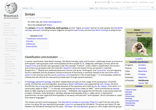
As you can see, there are a bunch of tweaks mainly aimed at improving readability and reducing visual clutter. The Wikipedia we all know and love is still there in spirit, though.
Some notes
I’ve deliberately written the CSS to be as unspecific as possible, the idea being that Wikipedia works pretty well as it is so I don’t want to break stuff. Some of the rules are a bit weird, but that’s mainly because I’m trying to work around the defaults as much as possible.
Note that although most text has plenty of contrast, a few small bits (for example reference markers) aren't very high contrast. This is to aid readability for most people but if you need to bump up the contrast, it's easy to tweak the CSS to suit your needs.
Also I have formatted the CSS single-line to save a few bytes - I know it’s a drop in the ocean but a few bytes here and there could save or cost the Foundation some real money.
Wrapping up
I really hope you find this useful and that it helps to make your learning experience that little bit more pleasant.
I’d love to hear your thoughts on this, so please get in touch via Twitter, email or a comment and let me know!
Posted on Friday, 12th July 2013.
Feedback
Sorry, feedback is now closed on this post, but please feel free to get in touch if you would like to talk about it!
-
Kris

Update: changed default font to Open Sans (rather than Droid Sans) after a suggestion from Paul Maloney. Thanks Paul!
-
Kris

Minor update: Made the “From Wikipedia…” subheading a bit lighter, section edit links a bit darker on hover, and added in the cross-browser transitions I forgot about (sorry!)