Hi! I'm currently reworking my site, so although this content is still online things may change or look odd. Please get in touch to find out how I can help you!
12412 January - Responsive Web Design

For me, one of the most fun things about working on the web is the fact that there's always new things to try out - be it a new technology, a new framework or just a new way of thinking about the way we work.
The tricky part is trying to keep up with everything - it's so easy to fall behind and then feel like you'll never catch up.
That's why I think the 12412 initiative is such a great idea. Commit yourself to learning about something new each month and by the end of the year you'll have experienced a dozen things you hadn't tried before.
So, for January's effort I decided to finally get around to learning about perhaps the biggest talking point of the last couple of years - responsive web design.
What is it?
In essence, "responsive web design" is the buzzword (buzzphrase?) that encapsulates a bunch of techniques which aim to make a website "aware" of the canvas it has available to display itself on - the canvas being the user's browser window.
Such techniques include a fluid- rather than fixed-width grid system, media queries and the use of JavaScript to selectively load content based on the size of the viewport.
The concept of fluid-width designs is not a new one of course, but the advent of media queries and the huge leaps in the quality of small-screen browsers have made it easy and necessary to consider the context in which our designs are viewed.
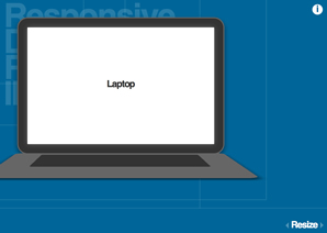
For example, a fixed-width design at 960 pixels will look great on a desktop monitor or laptop, but a smartphone with a screen only 320 pixels wide will either introduce horizontal scrolling or zoom out to fit the whole page in the viewport, forcing the user to manually zoom in if they want to actually read your content.
A responsive website would instead display a different set of styles and perhaps even different content based on the space available to display it. If you want to see what it looks like in the wild, check out the recently-launched Smashing Magazine redesign by Elliot Jay Stocks and resize your browser window - there's everything from a wee narrow layout for smartphones, right through to a super-wide layout for the big screens.
How to do it?
It sounds a bit daunting at first to consider that you'll be designing for so many different use cases, but really it's quite simple, providing you keep it in mind from early on in the design process. Retrofitting is certainly possible but not as easy as building responsively from the ground up.
First steps

As with any design, the bedrock is a solid grid system. Rather than using pixels though, we use percentages to allow our design to grow and shrink with the browser window.
Once you've got your grid layout built, you'll probably find that there are certain points where the design stops working quite so nicely. Perhaps on narrower screens your lovely horizontal navigation drops down onto two lines, or maybe on a wider screen your paragraphs get too wide and become hard to read.
These are your design's breakpoints and this is where media queries come in. If you determine that the minimum width your navigation can be displayed nicely at is 600 pixels, then you would set a media query to alter the styles at anything below 600 pixels, like this:
@media screen and (max-width: 599px) {
	/* styles for screens < 600px wide here */
}
Delving deeper
Once you've done that and fixed the main breakpoints in the design itself it's time to consider the content.
As the design gets narrower you might want to change the font sizes, leading and perhaps margins and padding on your content to make it easier to read on smaller screens.
For richer media such as images or videos there are a few things we can do. Setting a max-width of 100% on an image will make it resize so that it never escapes the boundaries of it's containing element. Thankfully, browsers are intelligent enough these days to resize an image proportionally rather than stretching and squashing our beautiful photos and illustrations.
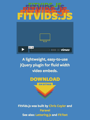
Videos are a bit more tricky, as the iframes used by the big video-sharing sites for their embed codes don't respond in the same way as images or even the HTML5 video element. Luckily for us, Chris Coyier and the clever guys at Paravel have come up with FitVids.js, a jQuery plugin that takes your videos and makes them properly responsive with a single line of JavaScript.
As responsive web design begins to mature, I'm sure we will see the niggly problems such as videos being squashed but in the meantime we can just do what we have always done and design defensively, making sure our content is still usable if not beautiful when we hit those breakpoints.
It's that easy?
Well, yes and no. The basics of responsive design are fairly straightforward and shouldn't be hard to get to grips with. Anyone who's designed with a fluid or elastic layout before will be familiar with some of the issues faced, and adding media queries for breakpoints is straightforward.
What can get tricky is when you have a relatively complex design that needs to be converted from flat comps to proper HTML/CSS goodness. One way around this problem could be to design in the browser, gradually layering up the design until it looks great but with the responsiveness baked in from the very beginning. Then again, it may just be that we need to design with the fact that the layout needs to be malleable always in the back of our mind.
Sure, responsive design gives us a lot of challenges, but it also helps us to serve users better so I think the challenges are worth overcoming. No doubt there will be browser improvements, JavaScript fixes and innovations in CSS that will smooth the path and make it easier for designers to dabble with responsive design.
How can I learn more?
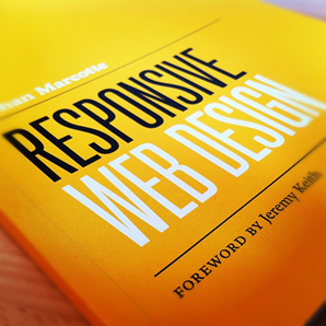
I can't not mention "the book" on responsive design, the aptly-named "Responsive Web Design" By Ethan Marcotte. It's very well written and Ethan's enthusiasm for responsive design really shines through and makes you want to get involved.
As well as the book, there are or course thousands of articles online. .net has a bunch, Smashing Magazine has a few and you'll also see a few on sites like 24ways. Of course, you could always do a Twitter search for the #RWD hashtag too.
Start now!
One thing that I like about responsive design is that you can start right away. Even on an existing fixed-width design, and even if it's just a single breakpoint so that it's easier for people to read your stuff on a mobile device. I know that's not really the idea but if it benefits the user then some responsiveness is better than none in my books.
I'm currently working on just that for this site - it's readable enough on a tablet but on a mobile screen it's a bit small, so keep your eyes peeled for a new "mobile version" soon!
Conclusions
Overall I think this was a great start to 12412 for me - it's something that will influence my design work from now on so a good thing to make acquaintance with early on.
Writing this up has made me wonder why I haven't gotten to grips with responsive web design sooner - perhaps I was just afraid that it would be too complicated but in honesty the only problem it's causing me now is that I want to responsive-ize everything I've ever worked on. That's partly why I'm posting this at the end of February - I've been having so much fun experimenting I've not gotten around to writing it up!
I'd love to know your thoughts on responsive design - what were your first experiences with it? What have you discovered that wasn't immediately apparent from reading books or blog posts? Have I totally missed the point with my "single breakpoint" idea? Let me know in the comments!
Posted on Friday, 24th February 2012.
Feedback
Sorry, feedback is now closed on this post, but please feel free to get in touch if you would like to talk about it!